Color is one of the most powerful tools a homeowner has — and one of the most underestimated. The right palette can make a compact room feel expansive, a stark space feel welcoming, or a dated interior feel completely refreshed. Whether you're planning a full home renovation or simply reconsidering the walls in a single room, knowing what's trending right now gives you a strong starting point.
Here's a look at the color directions making the biggest impact in Richmond and Chesterfield homes this year, along with some practical guidance on where each palette works best.
Earthy Tones: Warmth Grounded in Nature
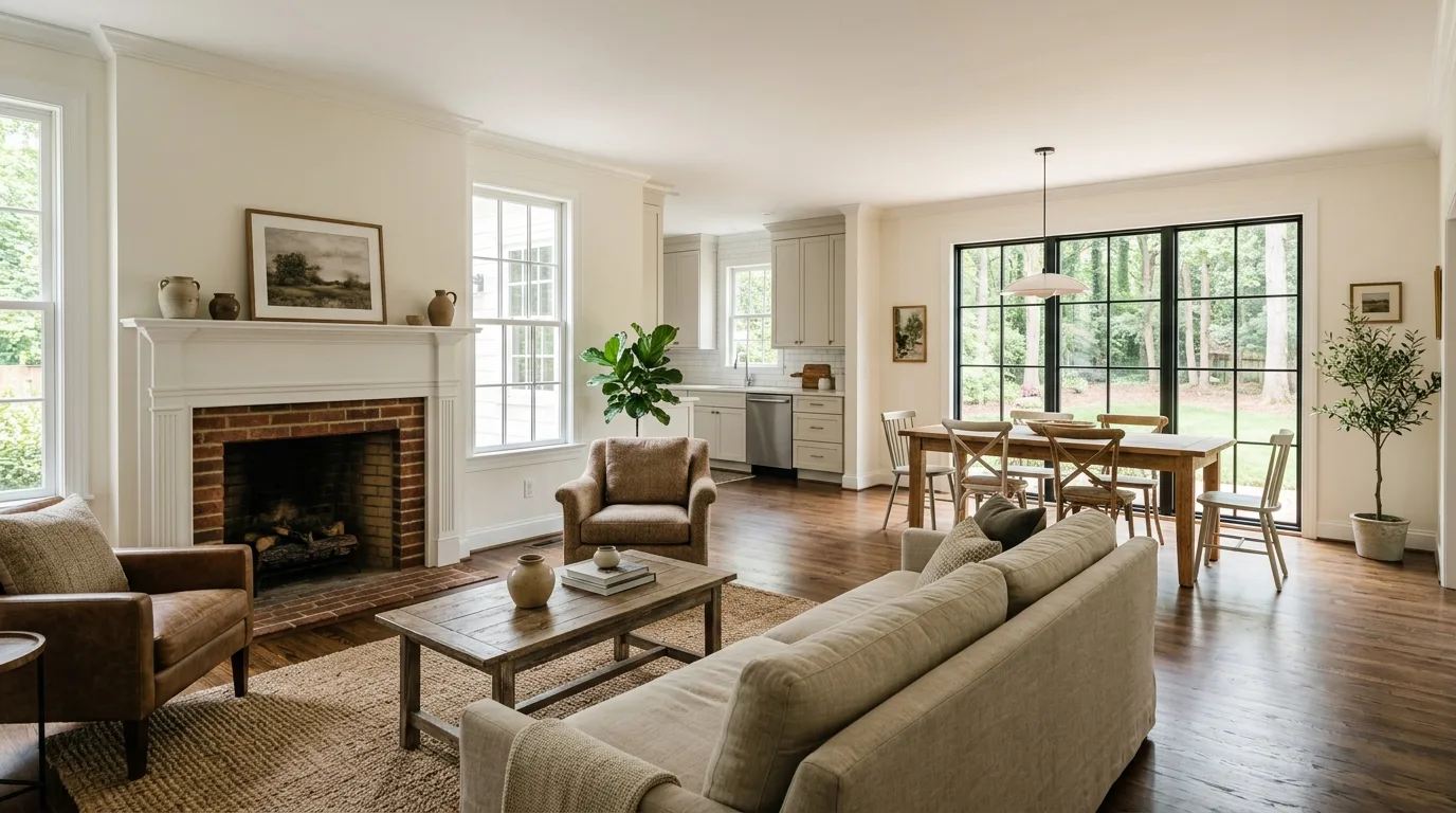
Earthy tones are taking center stage this year. These natural hues — inspired by clay, terracotta, and stone — create a warm, inviting atmosphere that works across a wide range of home styles. Whether your interior leans rustic farmhouse or clean modern minimalism, earthy tones adapt without effort. They're particularly effective in living rooms and bedrooms, where the grounding quality of the palette helps a space feel cohesive and calm rather than busy or unsettled.
Jewel Tones: Bold, Sophisticated, and Deliberately Chosen
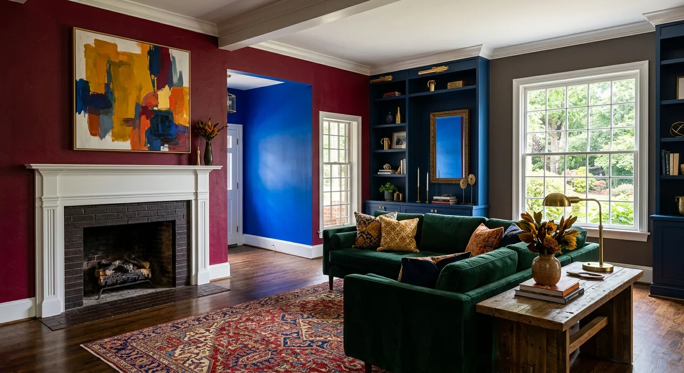
For homeowners who prefer their interiors to make a statement, jewel tones remain a compelling choice. Rich sapphire, deep emerald, and warm ruby bring depth and a sense of occasion to any room. These colors work especially well in dining areas or on a single feature wall, where they create visual drama without overwhelming the senses. If you're considering new flooring or updated trim to complement a bolder wall color, jewel tones pair beautifully with warm wood tones and brushed metal hardware.
Soothing Pastels: Softness With Staying Power
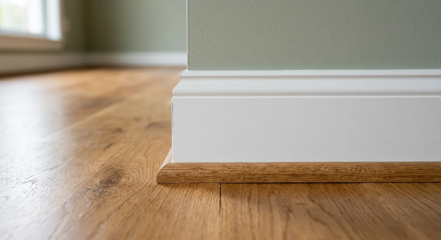
Pastels have moved well past their nursery associations. Soft sage, dusty rose, and muted sky blue are showing up in living rooms, home offices, and primary bedrooms across Richmond — and they're holding up as more than a passing trend. The appeal is straightforward: pastels add color and personality without committing to the visual weight of a saturated hue. They work particularly well in rooms that get strong natural light, where the softness of the tone keeps the space from feeling washed out. If you're crafting a home office or refreshing a bedroom, a well-chosen pastel can do a lot of quiet work.
Fresh Greens: Bringing the Outdoors In
Green has earned its place as a standout color for interior spaces, and the range is broader than most homeowners expect. Deep forest greens anchor a room with a sense of permanence and sophistication. Lighter olive and fern tones feel organic and easy, especially in kitchens and sunrooms where connection to the outdoors matters. If you're also thinking about your exterior — whether that's deck and patio work or updated siding — green interior palettes can create a natural visual flow between inside and out.
Warm Neutrals: The Timeless Foundation
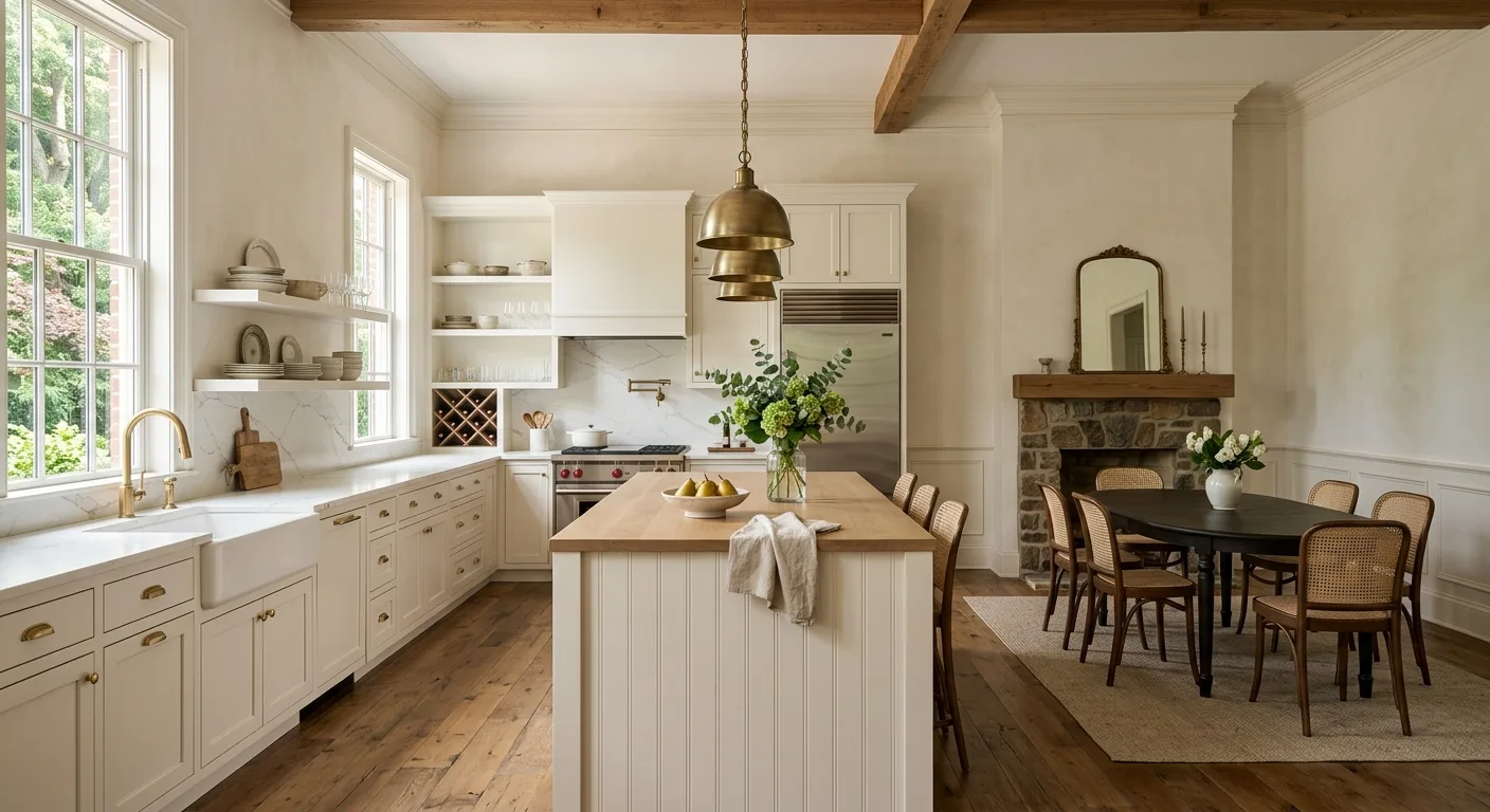
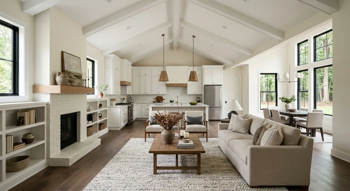
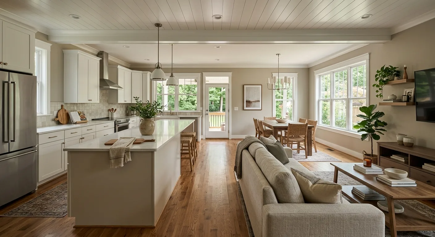
Neutrals remain a reliable foundation for a reason. This year, the cooler greys that dominated interiors for the better part of a decade are giving way to warmer options — beige, taupe, soft linen, and greyed-down whites with yellow or pink undertones. These warmer neutrals create a backdrop that's flexible without being indifferent. They let furniture, artwork, and custom carpentry details take the visual lead without competing for attention. For Richmond homes with traditional architectural character, warm neutrals feel especially at home.